
Work / Protoby
Rebranding a major player in hydrological improvements
Challenge
Protoby is a major player in an industry where scale is the common denominator. With complex projects and international expansion, the company struggled with effectively articulating what made them different in the marketplace and the value they provide to their clients.
The company’s visual identity did not reflect Protoby’s evolution into a dynamic, innovation centered business.
Solution
Protoby needed an approach as innovative as they are. The creative route was one of discovery, unraveling what the company stood for visually. After exploring water and its many visual representations we’ve developed a unique symbol that is fluid while rigorously geometric.
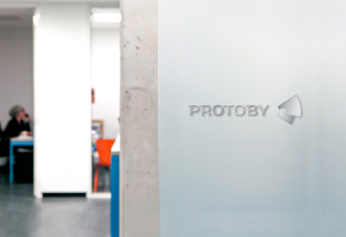
The two intersecting shapes stand for evolution and dynamism. The gradient treatment was meant to express transparency as a water characteristic and as a way of doing business.
The resulted graphic language is both powerful and personal expressing the individuality of its professionals and the versatility of the provided solutions by unifying all their expressions.
Finding that unique metaphor to express complex ideas is what drives our creative process every time.
George Nisioiu, founder & partner, innerpride
Result
The new Protoby expresses the company’s innovative approach. It manages to empower the employees and unifies the brand.
Having the tools it needs, Protoby sets the stage for future growth reinforcing the brand’s expertise and ability to deliver challenging projects.
Our company has reached a level of maturity that needed a new approach in terms of visual identity and business communication. innerpride managed to create a visual identity capable of taking us to the next level.
Cosmin Tobolcea, partner, Protoby
At the end of the day, it’s all about what we can do for you and your company.
We’re not only a very capable team, we’re also good people.
Offices / Headquarters
Colonel Langa 17, Iași, Romania